The design problem
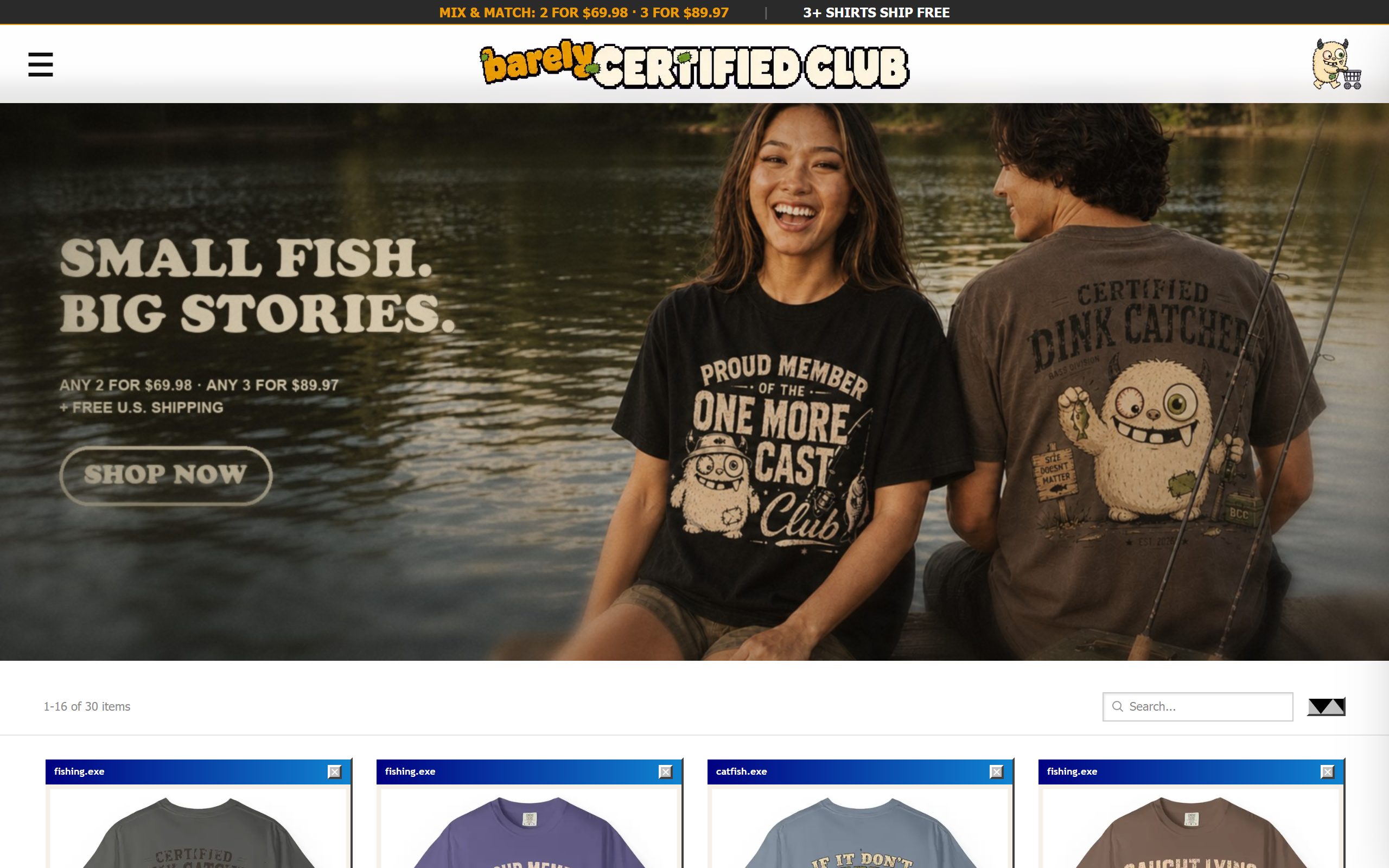
Apparel is the most crowded category online, and 90% of stores ship the same theme with a different logo. A visitor from a social ad gives you about two seconds. If the site looks like every dropshipping store they've ever closed, it's over before the product gets seen.
Design decisions that do work
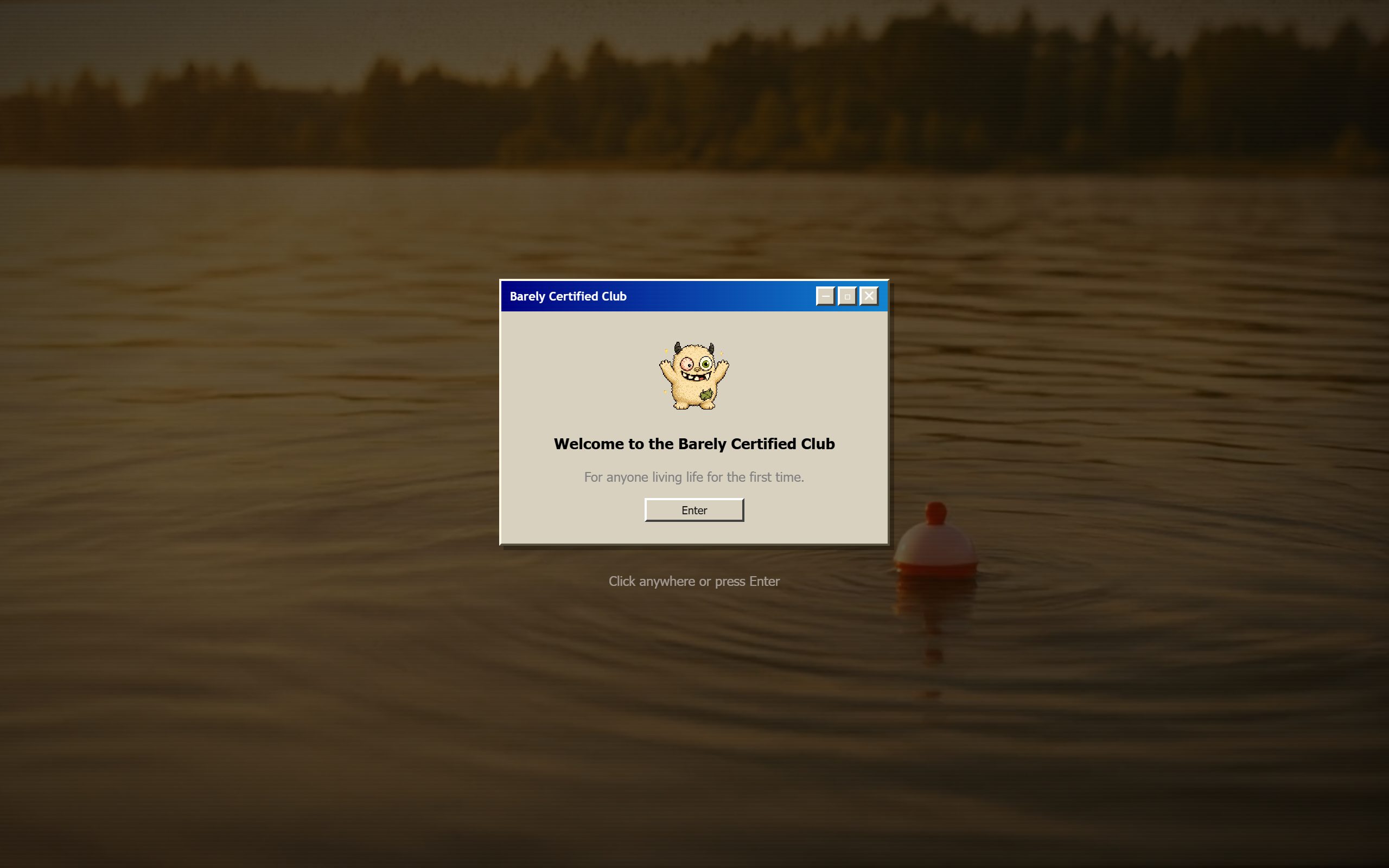
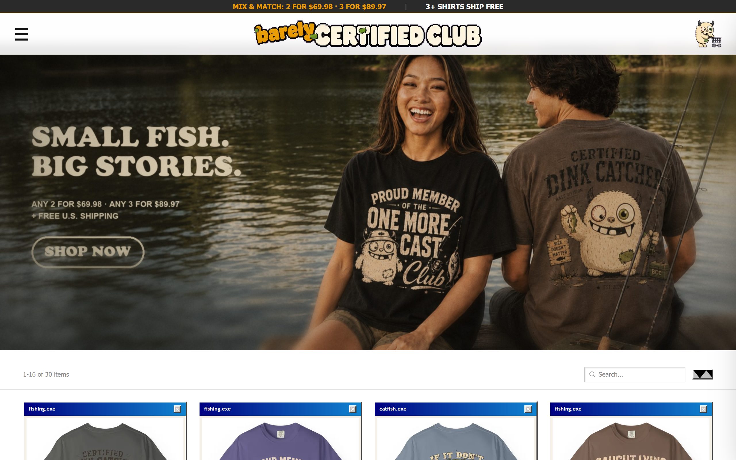
- A retro operating-system design language. Product cards render as little desktop windows, the entrance is a dialog box, system fonts and pixel details carry through. It's instantly recognizable, endlessly memeable, and it makes screenshots of the site self-advertising.
- A mascot that carries the brand. The character appears at the door, in empty states, in error messages, turning boring UI moments into brand moments people remember and share.
- A welcome gate as a feature, not friction. The dialog-box entrance sets tone in one second and makes the brand feel like a place, not a page. Bounce didn't suffer; recall did the opposite.
- Phone-first conversion UI. Sticky bundle pricing in the header, one-thumb navigation, express payment (Apple Pay / PayPal) surfaced early, built for buyers arriving through in-app browsers.
- Fast under personality. All the character is CSS and lightweight assets. The site stays quick on a mid-tier phone on cell data, which is where the actual customers are.
The point
Distinctive design isn't decoration, it's a conversion asset. When the storefront itself is memorable, every ad click works harder and organic shares come free. And because it runs on a custom backend, the front end never has to compromise to fit a theme's limits.